Luxury website design: restraint, typography, photography and speed, and the mistakes that make a site look cheap
What makes a website feel luxurious: restraint, type, space, photography and fewer words. What looks cheap, Hebrew type, what luxury houses do, and a checklist.
Part of the guide: How to build a business website, step by step
A luxury website looks luxurious because of what it leaves out: fewer words, fewer colours, fewer elements on each screen. What remains is excellent photography, precise typography with generous space, slow motion that has a reason, and names and facts instead of slogans. And it loads quickly, even with large images. What breaks the feeling fastest is anything that signals a sale: pop-ups, discount banners, countdown timers and stock photos.
This article is about design: what people see and feel. If the site sells, the commercial side of a luxury store, from payment to delivery and packaging, is in our guide to building a luxury online store.
What makes a website feel luxurious
Restraint
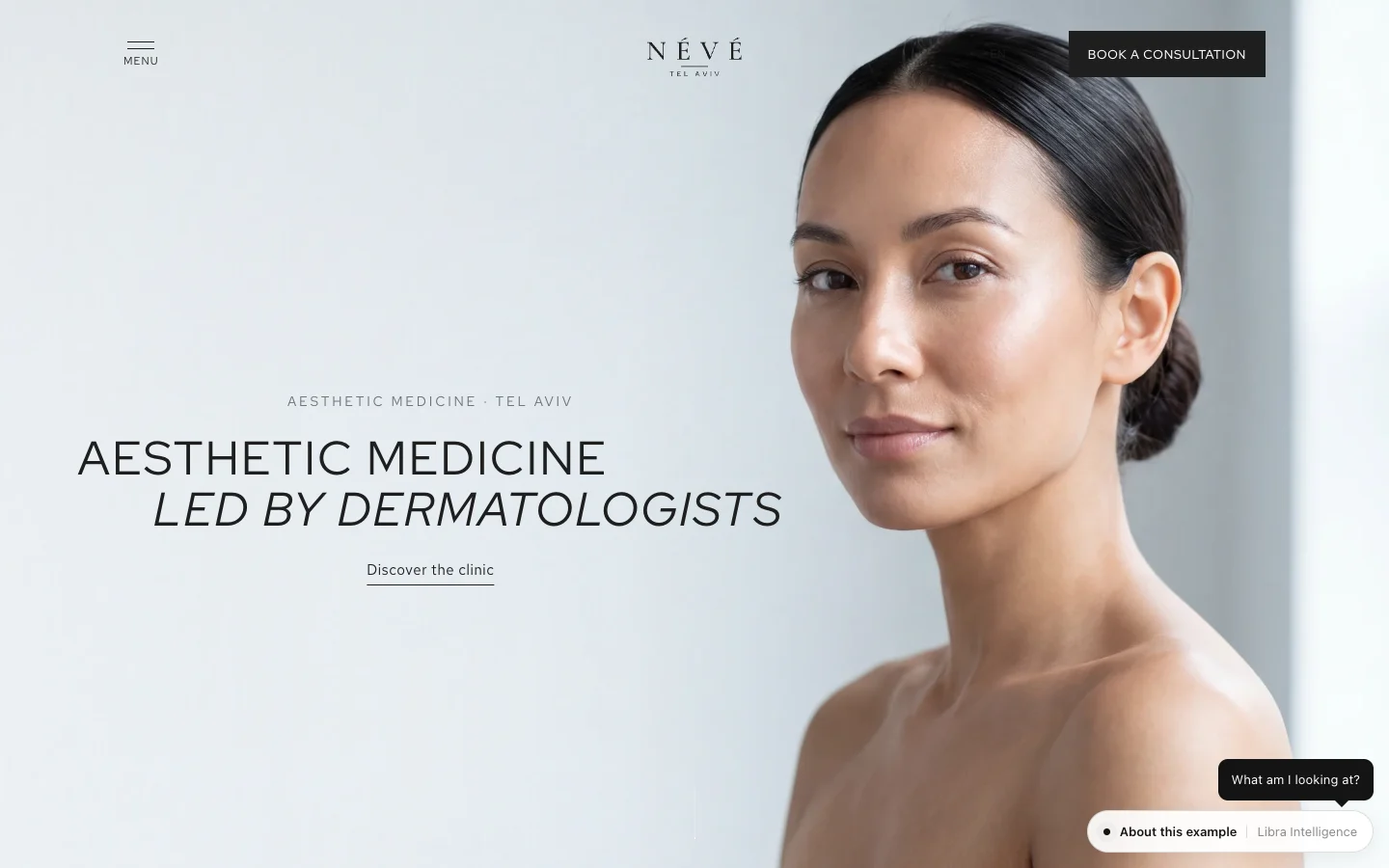
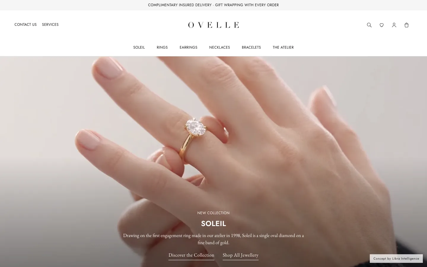
Each screen does one thing. One large image, one line of text, one link. A luxury house has no need to prove it has a lot; it chooses. On a website, choosing looks like few items per screen and wide space around them.
Typography
One typeface, two at most, in few weights. Large, light headings; small, comfortable body text; generous line spacing. Small uppercase labels with open letter-spacing are for navigation and categories, not for body copy. Precision is everything: the same size for the same role on every page.
Space
Wide margins and large gaps between sections are not wasted space. They are what gives each item weight. A crowded site looks like a catalogue; a spacious one looks like a gallery.
Photography
Photography is most of the work. Product in one consistent light, on one background, with details that hold up when zoomed: material, stitching, polish. People with the product, in use, not only the object alone. If photography at that level is not ready, delaying the launch is better than launching with average images. Producing product images, including with AI, is covered in AI product photography.
Slow, purposeful motion
Quiet background video, an image that fades in as you scroll to it, a soft transition between pages. Motion in luxury is slower than usual and always serves something: showing the material, the fire of a stone, the room. Animations that bounce, spin or react to every movement of the mouse do the opposite. And respect visitors who have asked their system for reduced motion.
Fewer words, more facts
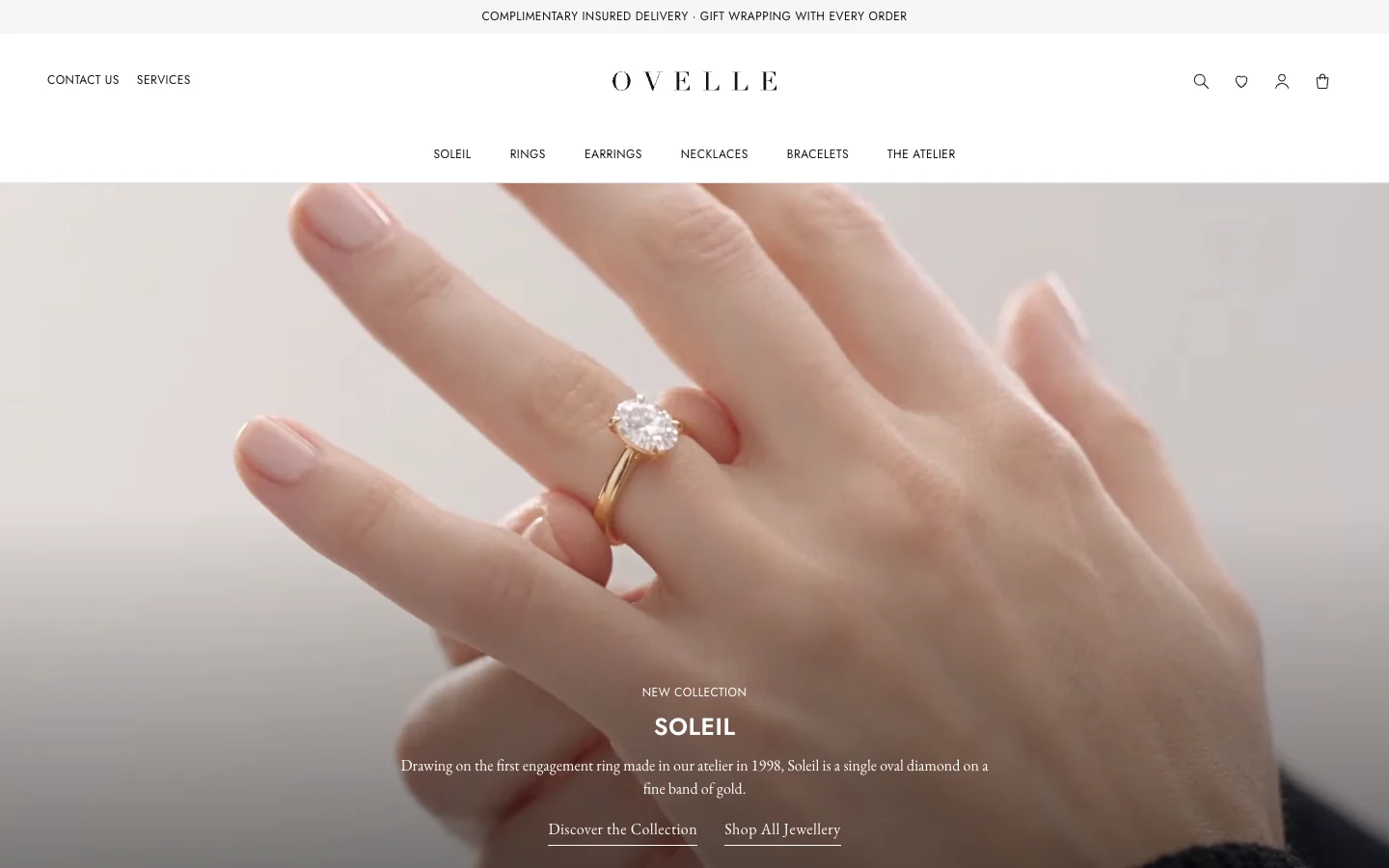
The product’s name, material, size, origin and price. “18-carat gold ring, 1.5-carat oval diamond, made in our workshop” says more than any paragraph about timeless elegance. Luxury houses write plainly, with real names: of the collection, the workshop, the stone. No slogans, no invented reviews, no superlatives.
Speed despite large images
A luxury site that loads slowly feels like a boutique whose door sticks. Images in modern formats such as WebP or AVIF, sized for the screen, lazy loading for what sits below the fold, and compressed silent video. Google’s Core Web Vitals set the target: the largest content on the page loaded within 2.5 seconds, and no jumping layout while it loads. That is achievable with a full-screen image, if the site is built for it from the start.
What makes a website look cheap
| What | Why it looks cheap | What to do instead |
|---|---|---|
| Stock photos | Visitors have seen them before, and your product is not in them | Photographs of the product and the place, or renders based on the real product |
| Gold gradients, glitter and marble textures | An imitation of a precious material instead of the material itself | One quiet colour; let the photography show the material |
| A pop-up on arrival | Interrupts before the visitor has seen anything | Newsletter sign-up at the foot of the page or after purchase |
| Discount banners and countdowns | Says the full price is not worth it | One clear price, no permanent sale |
| Three or more typefaces | No hierarchy, nowhere for the eye to rest | One or two typefaces, few weights |
| Long copy on every screen | Reads as a hard sell | One sentence; details live on the product page |
| Chat bubbles, “Sold!” badges, colourful icons | The noise of a mass-market shop | Customer service available but quiet, in a fixed link |
| Fast animation everywhere | Distracts from the product | Motion in one or two places, slowly |
Luxury typography in Hebrew and other right-to-left scripts
Most luxury references are in English, and much of what works there does not carry over to Hebrew as it is. For a brand with a Hebrew site, these points need their own decisions:
- No capital letters. Hebrew has no uppercase, so the small spaced capitals associated with luxury in English have no direct equivalent. Hierarchy comes from size, weight and space, and heavy letter-spacing breaks Hebrew words apart.
- Pairing Hebrew and Latin type. A brand name in English beside Hebrew text should look like one family: the same visual weight, apparent height and optical feel. A Latin serif does not always have a good Hebrew partner, so the pair is chosen together.
- Fewer weights and fewer display faces. The choice of Hebrew display type is smaller. Check in advance that the face has the weights you need, a web licence, and support for the proper geresh and gershayim (׳ ״).
- No true italic. Slanting Hebrew letters artificially looks like a fault. Use weight or size for emphasis.
- Mixed direction. Numbers, prices, English names and punctuation inside a Hebrew sentence can flip. Check every such line in a browser, not only in the design file.
- Arrows and icons. “Next” points left in Hebrew. Galleries, sliders and arrowed links need mirrored versions.
- Optical size. Hebrew letters look smaller than Latin ones at the same point size, so Hebrew text sometimes needs to be slightly larger for lines to look equal.
A site in two languages is two versions to design, not a translation; see bilingual websites.
How luxury houses design their websites
Across the sites of houses such as Tiffany, Cartier, Hermès and the Aman hotel group, a few patterns recur, each in its own style:
- One image owns the screen. On the home page, a single product or place at full size, with very little text over it.
- Names, not descriptions. The collection, the model, the hotel and its location. The description is short and factual: material, stone, size, place.
- Short navigation. Few categories, in plain words. No first row crowded with dozens of links.
- Personal service shown as service. Booking an appointment at a boutique, engraving, sizing, packaging. These appear as part of the brand, not as commercial extras.
- No permanent sale signals. No discount banners and no countdowns on the home page.
- Consistency. The same palette, typefaces and photographic light across the whole site, from the first page to the email after purchase.
Learn from their structure and pace, not their style. Your brand should look like itself.
The luxury product page
In a store, the product page is where all of this meets: a large gallery with zoom, the name, price, materials and sizes in plain words, delivery, returns and packaging before the button, and a way to ask a question in writing. What it needs and in what order is covered in a product page that sells.
A luxury website checklist
- Each screen has one main thing, with space around it.
- One or two typefaces, each size with a fixed role.
- All images from one production or in one photographic language; no stock.
- Short copy with names and facts, no slogans, and no reviews that real customers did not write.
- No pop-up on arrival, no discount banner, no countdown.
- Motion is slow, in few places, and respects reduced-motion settings.
- Pages load fast on a phone, and images do not push content around while loading.
- Contrast is readable: WCAG asks for at least 4.5:1 for normal text and 3:1 for large text. Thin light-grey text on white is the common mistake in quiet design.
- In Hebrew: a matched Hebrew–Latin pair, correct gershayim, mirrored arrows, and lines with numbers and English checked in a browser.
- The site meets accessibility requirements, built into the code rather than added by a plugin.
- Service, delivery, returns and packaging are written clearly, in a fixed place.
What a luxury website costs
The price is set as for any site, by templates, languages and integrations, but two items grow on a luxury site: photography or image production, and the work on detail, from motion to typography in two languages. Ranges by type of site are in how much a business website costs.
Examples from the studio
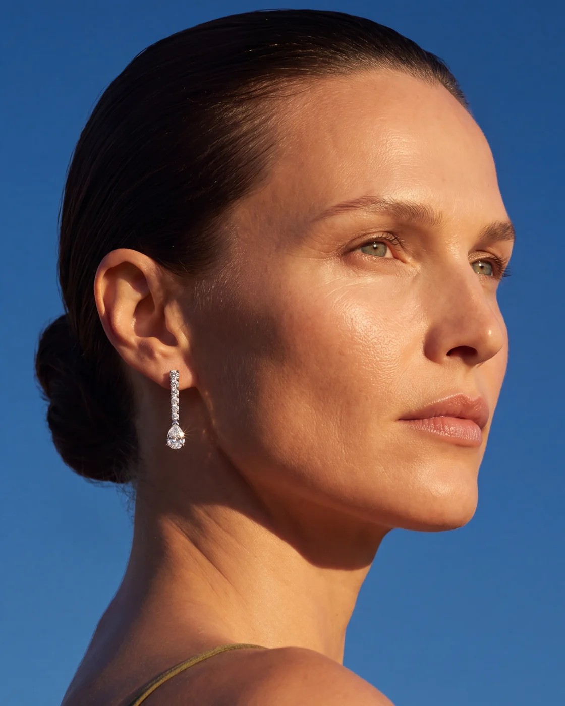
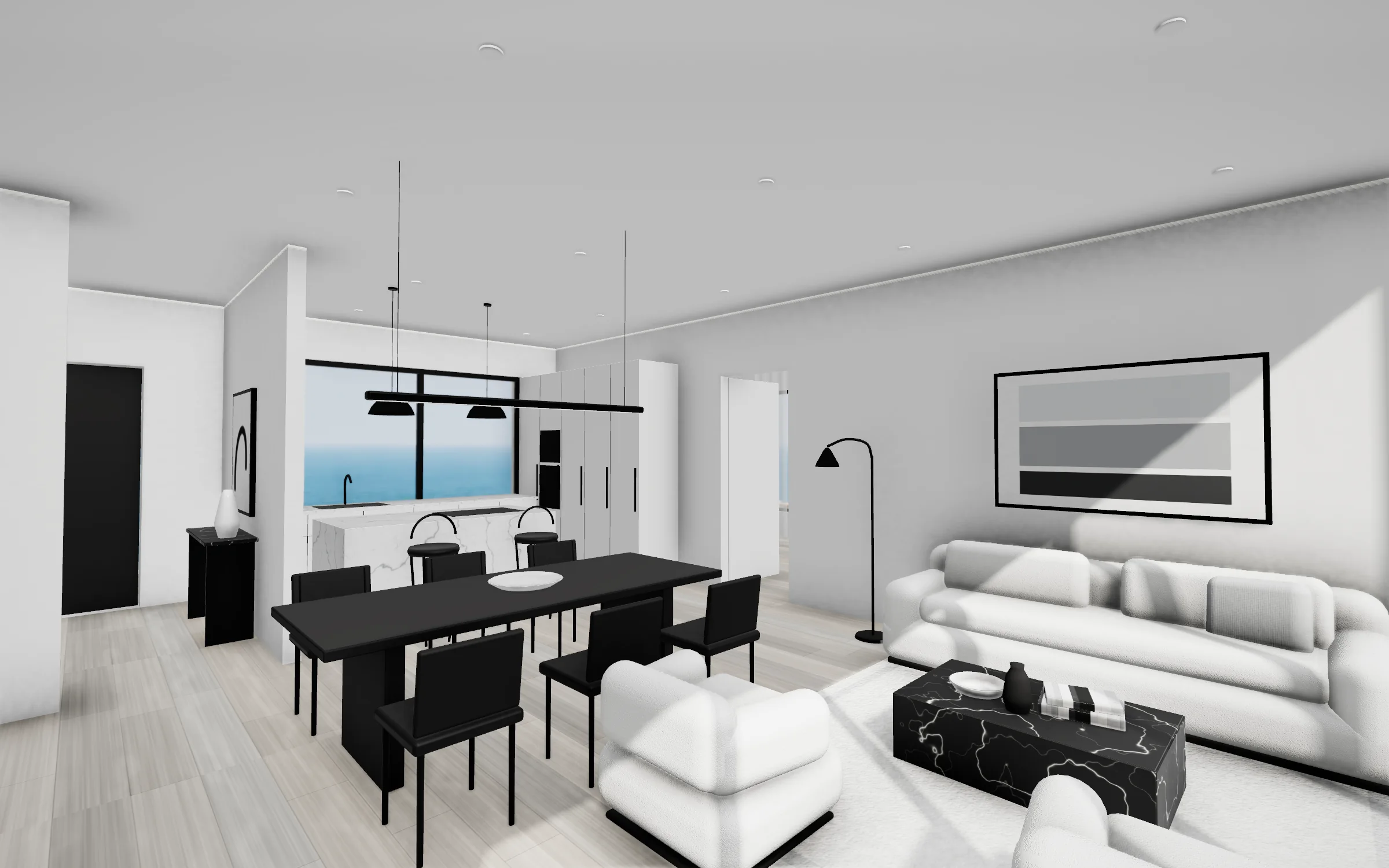
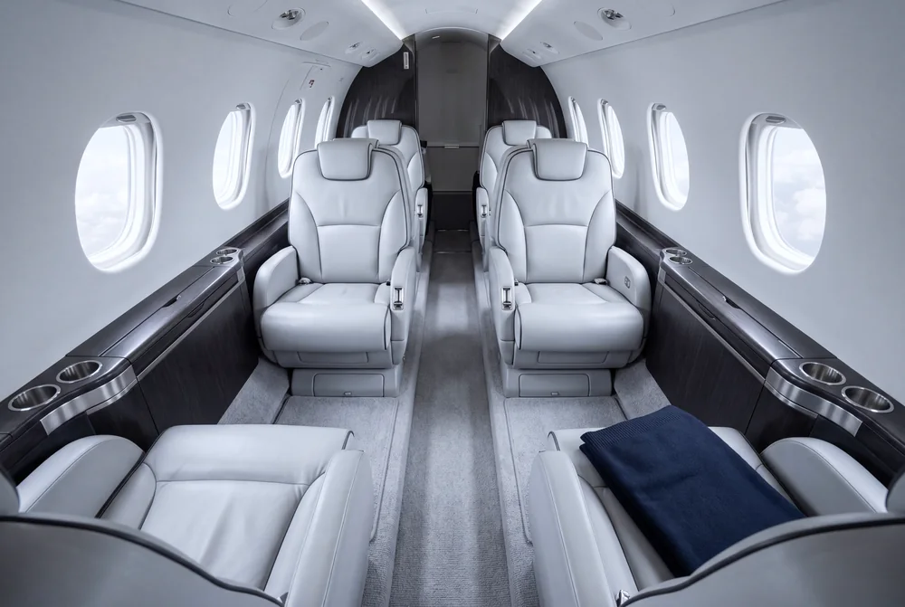
The OVELLE jewellery store, pictured at the top of this page, is built on these principles: a black-and-white palette, one image per screen, collection names and facts about the material. The furnished ALBA residences show luxury property presented through quiet 3D renders rather than promises, and the SKYLARK platform shows that even a private-flight booking system can be restrained and matter-of-fact. These are concepts we built with fictional businesses.
Luxury website design at Libra
We design and build websites and stores for luxury brands, in Hebrew and English, including the copy, image production, typography in both languages and accessibility. The work is described on websites, landing pages and stores. If you are planning a site for a luxury brand, send a brief with the products, what has already been photographed and what the site needs to do. We reply by email with a direction, a written price and a date.
No term matches.
Questions
What makes a website look luxurious?
Restraint: fewer words, fewer colours and one thing per screen. Excellent photography, precise typography with space, slow motion, and names and facts instead of slogans. And the site loads quickly even with large images.
What makes a website look cheap?
Stock photos, gold gradients, pop-ups, discount banners and countdowns, more than two typefaces, long copy on every screen, and fast animation everywhere.
How do you handle luxury typography in Hebrew?
Build hierarchy from size, weight and space, since Hebrew has no capitals. Choose the Hebrew and Latin typefaces together so they read as one family, avoid artificial italics, and check lines with numbers and English in a browser.
Can a luxury website be fast with large images?
Yes, if it is built for it: WebP or AVIF, images sized for each screen, lazy loading and compressed video. Google recommends the largest content on a page load within 2.5 seconds.
Does a luxury website need to be accessible?
Yes. Many countries require it for sites that serve the public, most based on WCAG; in Israel the standard is 5568 at level AA. Quiet design needs particular care with light-grey text and unlabelled buttons.
What can you learn from luxury houses’ websites?
Structure and pace: one image per screen, names instead of descriptions, short navigation, personal service presented as part of the brand, and no permanent sale signals. Not the style itself.
Getting started
Want this for your business?
Send a short brief: three required questions, the rest only if you like. We reply by email with a direction, a written price and a date.