The product page that sells: anatomy of an ecommerce product page
What a product page that sells needs: images, title and price, variants, one buy button, delivery and returns, specs, honest reviews, structured data and speed.
Part of the guide: How to start an online store: the complete guide, with notes for Israel

A product page that sells answers the buyer’s questions before they have to ask: what exactly this is, what it looks like from every side and at real size, what it costs including delivery, when it will arrive, what happens if it does not fit, and why buy it here. In practice that means good images from several angles, a clear title and price, simple variant selection, one prominent buy button, delivery and returns right next to it, full specifications, and a page that loads fast and works for everyone.
This article goes through the page part by part: what each part has to do, where it usually goes wrong, and a checklist to hold against any product page. The product page is one piece of a store with payments, shipping and policies around it; the full picture is in our guide to starting an online store.
What should be on a product page
| Part | What it does | Common mistake |
|---|---|---|
| Images and video | Show the product from every side, at scale and in use. | One image on white with no clue to size. |
| Title | Says what the product is, in the words people search. | A poetic collection name without the word for the product. |
| Price | The final price with shipping cost or the free-shipping threshold. | Shipping revealed only at checkout. |
| Variants | Colour, size or material, with stock shown for each option. | A dropdown that hides what is sold out until after the click. |
| Buy button | One clear action, visible without scrolling. | Three similar buttons competing with each other. |
| Delivery and returns | Estimated delivery and the returns policy in one line by the button. | A link to the terms in the footer. |
| Description and specs | Materials, dimensions, weight, care, what is in the box. | Generic marketing copy without a single number. |
| Trust | Real reviews, warranty, business details and service. | Reviews nobody can trace to a buyer. |
| Technical layer | Structured data, speed and accessibility. | A beautiful page that loads slowly on a phone. |

Product images: angles, scale, video and 3D
Online, images replace the hand that picks the product off the shelf, so they have to answer the same questions: what does it look like from the front, back and side, how big is it, what do the material and finish look like up close, and how does it look in use. A typical set is a clean main image, two or three angles, a detail close-up, a scale shot and one in context.
- Scale: jewellery on a hand or neck, a bag on a shoulder, furniture in a room. Without it buyers guess, and return.
- Close-up: stitching, engraving, texture, the stone. This is where an expensive product explains its price.
- Short video: how fabric moves, how a stone catches light, how a dial turns. A few silent seconds are enough.
- 3D: a model the buyer rotates. Shopify, for example, accepts 3D files in GLB and USDZ formats in product media, next to images and video.
- Consistency: the same background, light and main angle across products, so the collection page looks like one store.
Product images can now also be produced with AI, provided the product itself stays faithful to the real item: same shape, same material, same detail. How that works and when to still shoot is covered in our article on AI product photography.

Title, price and what sits under them
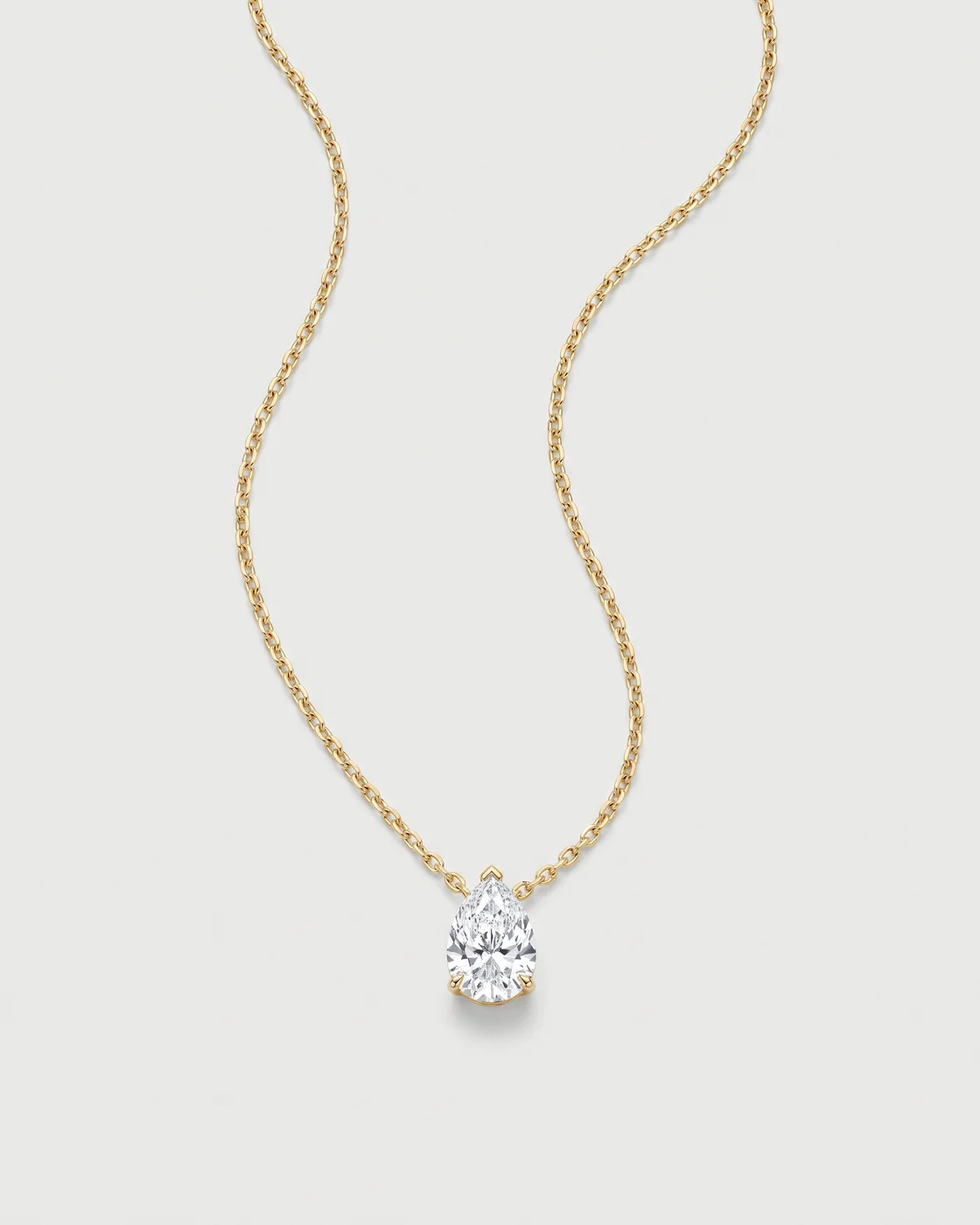
The title should say what the product is in the words people search: “14K gold necklace with a pear-cut diamond” tells more than “Soleil”. Keep the collection name, but next to the description, not instead of it. Under the title comes the price, final and including any tax the buyer expects to see, and next to it what affects it: shipping cost or the free-shipping threshold, and payment options such as instalments where they exist. The higher the price, the more it matters that nothing new appears at checkout.
Variants: colour, size and material
Choosing a variant should be quick and obvious. Show colours and metals as swatches rather than a dropdown, and switch the main image with the choice. A sold-out size should look sold out before anyone clicks, ideally with a back-in-stock option. If variants differ in price, the displayed price should change immediately.
One buy button
A product page has one main action: add to bag or buy now. Its button should be the most prominent thing on the page and visible without scrolling, and on a phone it helps to keep it available as the buyer scrolls. Secondary actions, such as saving to a wishlist or sharing, should look secondary. After the click, the buyer should see at once that the item is in the bag, without being taken off the page.
Delivery and returns next to the button
“When will it arrive and what if it is wrong” comes up exactly when the buyer is deciding whether to click. So the answer belongs there: one line with an estimated delivery time, one line with the returns policy, and a link to the details. Not in the footer and not only in the terms. The legal side of returns depends on where you sell; for Israel it is covered in our guide to starting an online store.
Description, specifications and materials
The description answers “why”, the specifications answer “what exactly”. A good description is short: two or three sentences on what the product does or is made of, without superlatives. The specifications are a list: materials and percentages, dimensions and weight, care instructions, what is in the box, warranty, country of manufacture where relevant. Technical products deserve a table. For luxury goods, the facts themselves, such as gold weight or the origin of a stone, persuade more than any description.
Sizing and fit
In clothing, shoes and rings, uncertainty about size is a common reason not to buy, and to return. A size chart should give the product’s real measurements, not only S, M and L. Add how to measure, what size the model wears and how tall they are, and a note if the cut runs small or large.
Trust without invented reviews
Customer reviews help only when they are real, and buyers recognise reviews written for them. A genuine review comes from someone who bought the product, usually after a request email sent a few days after delivery. It is shown as written, including the less favourable ones, with a name or handle and a date. Writing reviews yourself, buying them or quietly removing negative ones is out. In the United States the FTC has a final rule banning fake reviews and testimonials, including AI-generated fake reviews, bought reviews and review suppression.
A new store has no reviews yet, and that is fine. Trust also comes from full business details and an address, a clear returns policy, a written warranty, real photographs of the product and its packaging, and quick answers to questions. What matters is not inventing a substitute.
Product structured data
Structured data is code that describes the product to search engines. According to Google’s documentation on product snippets, Product markup can make a page eligible for results showing price, availability and ratings, and it needs at least a name plus one of a review, an aggregate rating or an offer. Pages where the product can be bought directly have further requirements in Google’s merchant listing documentation: name, image, and an offer with price and currency, with shipping and return policies that can be marked up too. Most store platforms generate part of this automatically; check what is missing. Mark up ratings only if they are real and visible on the page.

Speed on mobile
A product page full of large images, video and 3D can load slowly, and most buyers arrive on a phone. Google’s Core Web Vitals treat these values as good, according to web.dev: LCP within 2.5 seconds, INP of 200 milliseconds or less and CLS of 0.1 or less. On a product page that means the main image in the right size and format loading first, video and 3D loading only when the buyer reaches them, and as few app scripts as possible.
Accessibility on a product page
An accessible product page is one you can buy from without a mouse and without seeing the images. Every image needs alt text describing what matters in it, the variant picker has to work with a keyboard and be announced by screen readers, prices and buttons need enough contrast, and the add-to-bag confirmation has to be announced. In many countries this is also a legal requirement for stores serving the public; Israel’s rules are in our article on website accessibility law in Israel.
How to know the page works
Measure. The basics are how many visitors add to bag, how many of those reach checkout and finish, and on which devices. Heatmaps and recordings show where people stop and what they miss. When a change looks important, such as the order of images or the wording of the delivery line, test it properly rather than by feel. How to run such a test is in our article on A/B testing and conversion optimisation.

Product page checklist
| Check | Question |
|---|---|
| Images | At least four: main, angles, close-up and scale? Consistent with the rest of the store? |
| Video or 3D | If the product moves, shines or turns, is there something that shows it? |
| Title | Does it say what the product is in the words people search? |
| Price | Final, with shipping or the free-shipping threshold and payment options? |
| Variants | Is sold-out visible before the click? Do image and price change with the choice? |
| Button | One prominent action, visible without scrolling and available on mobile? |
| Delivery and returns | Are delivery time and returns policy next to the button? |
| Specifications | Materials, dimensions, weight, care and box contents, in numbers? |
| Sizing | A size chart in real measurements, with how to measure? |
| Trust | Only real reviews, business details, warranty and service? |
| Structured data | Product with name, image, price, currency and availability, without errors? |
| Speed | Does the main image load fast on a phone? Are Core Web Vitals in the good range? |
| Accessibility | Alt text, keyboard, contrast and an announced add-to-bag message? |
| Measurement | Are add to bag, checkout starts and purchases tracked by device? |
Examples: a launch page and a store product page
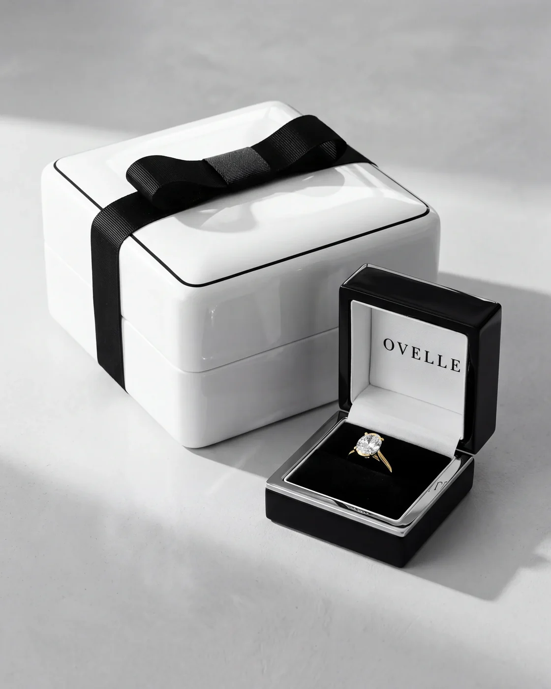
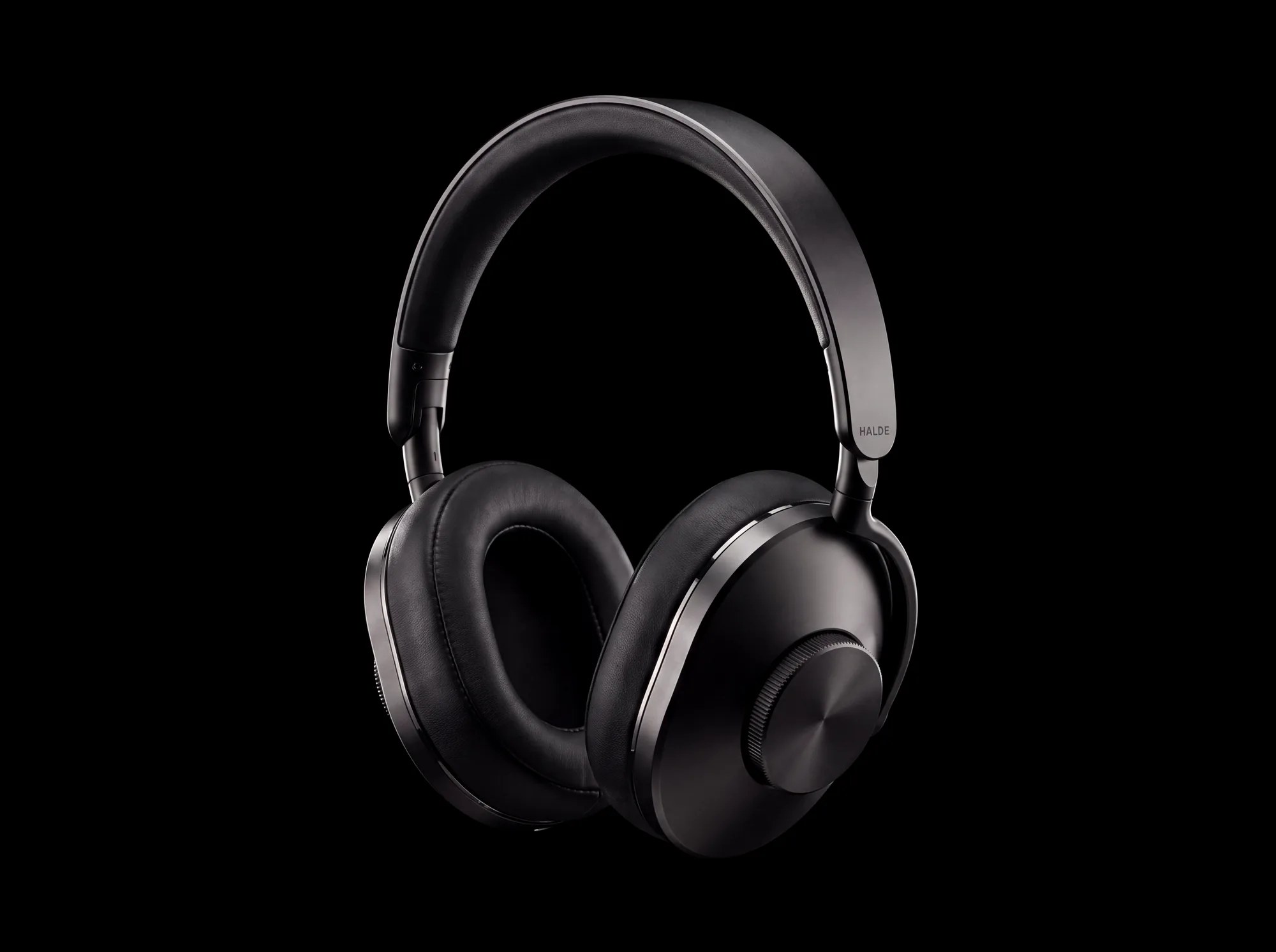
On the HALDE One launch page we built a product page for headphones: a film, scrolling that shows the product from every side, an interactive dial that demonstrates the control, and a buy module inside the page. It is a page for one product, where the whole page serves one decision. In the OVELLE store the product pages are built for a catalogue: consistent images, metal and size selection, delivery and packaging by the button, and a ring in 3D. Both are concepts we built to show the level of the work; the brands are fictional. Luxury brands add further layers to the product page, covered in our article on online stores for luxury brands.
At Libra we build stores and product pages, including AI product imagery, video and 3D models, described on our websites, landing pages and stores page. If you have a store whose product pages are not selling as expected, or a new product that needs a page, send a brief with a link and what you know about your buyers. We reply by email with a direction, a written price and a date.
No term matches.
Questions
What should a product page include?
Images from several angles and at scale, a title that says what the product is, a final price with shipping cost, variant selection, a prominent buy button, delivery time and returns policy next to it, and specifications with materials and dimensions.
How many images should a product page have?
There is no fixed number, but a typical set is a main image, two or three angles, a detail close-up, a scale shot and one in use. Add a short video for products that move or shine.
How do you write a product description that sells?
Keep it short and factual: two or three sentences on what the product does and what it is made of, followed by specifications with numbers. Facts persuade more than superlatives.
What if a new store has no reviews yet?
Do not invent them. Build trust through full business details, a written returns policy and warranty, real photographs and quick answers, and ask real buyers for reviews after delivery.
Does a product page need structured data?
It is worth having. Product markup following Google’s guidelines can make the page eligible for results with price, availability and ratings. Most platforms generate part of it; check what is missing.
Where should shipping and returns information go?
In one line next to the buy button, with a link to the full policy. That is the moment the buyer asks the question.
Getting started
Want this for your business?
Send a short brief: three required questions, the rest only if you like. We reply by email with a direction, a written price and a date.