Branding a business from zero: what happens at each stage
What a brand identity project includes: strategy, name, logo, colour, type and a system people can build with. What you receive, how long it takes and where projects stall.
Part of the guide: Business branding guide: what branding includes, from strategy to trademark
Branding a business from zero is a sequence of decisions, not a logo commission. The usual order is research and positioning, a name if you need one, a single strategy sentence, two or three visual directions, and then the logo, colour, typography, imagery direction and finally applications: signage, packaging, screens and uniforms. For a small or mid-sized business the brand identity design process typically runs 6 to 14 weeks, depending mostly on whether naming is included and how many people sign off each stage. What you should end up with is an organised set of files and a brand book that lets any supplier use the identity without guessing.
Brand, logo and identity are three different things
Most disappointments in branding projects start with these three words being used as one. A logo is a mark: a designed word, a symbol, or both. A brand identity is the whole system: logo, colours, typefaces, photographic style, grid, tone of voice, and the rules that connect them. A brand is what stays in customers’ heads after they meet the business. Nobody designs a brand directly; you design the identity and make sure it says what the business actually delivers.
A business that orders only a logo still has to decide, alone, what colour the sign is, which typeface the menu uses and how the website photographs look. Those decisions get made later, by different suppliers, and the business ends up looking different everywhere. A full identity answers them once.
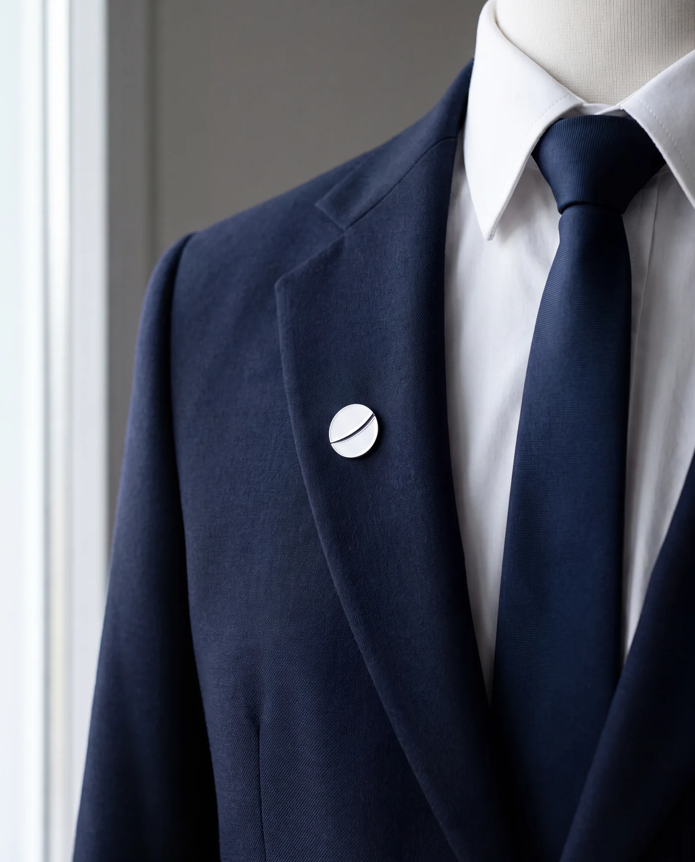
Branding process steps, in order
The order matters more than the number of steps. Each stage rests on the decision before it; skipping ahead usually means coming back later, at a higher cost.
1. Research and positioning
The first stage is listening. We read the brief, talk to whoever knows the customers best, and look at what direct competitors claim. The goal is to find open ground: what everyone in the category says, and what nobody says. By the end it should be clear who the audience is, what the business promises them, and how it differs. If you do not have a written brief yet, how to brief a studio lists what to include.
2. Naming, if needed
Not every business needs a new name. When one does, this is the hardest stage to schedule. A workable name is easy to say in every language the business uses, available as a domain and social handle, and clear of registered trademarks in the same class. Final legal clearance belongs to a trademark lawyer; the studio filters out names that clearly will not pass. Test each candidate on a sign, in an email address and spoken aloud.
3. One strategy sentence
Before anything is drawn, write one sentence that sums up the positioning: for whom, what, and how it differs. For a private aviation company: private flying that runs quietly, with no brokers and no surprises. It does not have to appear on the website. It is a test that every direction, and every argument about taste, returns to.
4. Visual directions
Two or three directions are presented, each a different reading of the same sentence. A direction is an early system, not a single logo: a mark, a colour, a typeface, a photographic sample and a few mocked-up applications. More than three almost always slows the decision.
5. Logo: wordmark, symbol and monogram
Once a direction is chosen, the mark is developed. A wordmark is the business name itself, precisely drawn, and suits most new businesses because it teaches the name. A symbol works when the name is already known or an app needs a small mark. A monogram, one or two letters, suits packaging, seals and small objects. Most identities need two of the three, in horizontal and stacked versions.
6. Colour
A working palette has one or two primary colours, neutrals for text and backgrounds, and sometimes a functional colour for buttons and alerts. Each colour is defined for print and for screen. Check text contrast now, because a colour that works on a sign can fail the website’s accessibility requirements (see WCAG 2.1). Black and white is a legitimate choice, and often the one that ages best.
7. Typography, including two scripts
Businesses that work in two scripts, such as Hebrew and Latin, meet a problem single-script brands never see. Hebrew has no capitals, a different x-height and fewer well-made typefaces. An elegant Latin face rarely has a partner in the other script with the same spirit, and side by side one looks larger or heavier. Choose the pair together, set them on the same line, and match size and weight by eye. Check numbers and prices inside right-to-left text, and confirm a web licence for every font.
8. Imagery direction
Photography shapes perception more than the logo, because it covers most of every page. An imagery direction defines light, distance, colour, and what is and is never in the frame. Where no photography exists yet, product and setting images can be produced with AI to the same direction, as long as the product stays faithful to the original.
9. Applications
The last stage tests the system in the world: a shopfront sign, a business card, packaging, a home screen, an app icon, uniforms, a social post. This is where problems show: a logo unreadable at 16 pixels, a colour that shifts on fabric, a name too long for a sleeve. That is why applications belong in the directions stage too.
The deliverables list
You should end up with files that let any supplier, from printer to developer, work without coming back with questions. The minimum:
| Deliverable | Format | Used for |
|---|---|---|
| Logo in every version: horizontal, stacked, symbol, monogram | SVG and vector PDF | Website, print, signage, scaling to any size without loss |
| The same logo in positive and negative, colour and black and white | PNG with transparent background | Presentations, office documents, social media |
| Small marks | Favicon and app icon at the required sizes | Browser tab, phone home screen |
| Colour palette | CMYK, Pantone, RGB and HEX values | Print, screen, code |
| Typefaces | Font files with desktop and web licences | Design, website, documents |
| Templates | Presentation, letterhead, social post | Day-to-day work by the team |
| Brand book | PDF or a web page | The rules that hold everything together |
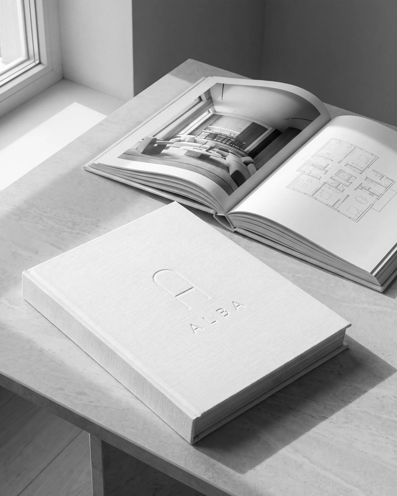
The brand book keeps the identity consistent after the studio leaves; its chapters are covered in what goes in a brand book. A working example is the ALBA brand guidelines, a residential tower we built as a concept (the business is fictional).
How long each stage takes
Reasonable ranges for a small to mid-sized business with one or two decision-makers and feedback within a few days:
| Stage | Typical range | What stretches it |
|---|---|---|
| Research and positioning | 1–2 weeks | An unfamiliar category, little customer knowledge |
| Naming | 2–4 weeks | Taken domains, trademark checks, several rounds |
| Strategy sentence | A few days to a week | Partners who disagree |
| Visual directions | 1.5–2 weeks | Requests for more than three directions |
| Logo, colour and typography | 2–3 weeks | A script pairing that does not work, revision rounds |
| Applications | 2–4 weeks | Number of applications, packaging that needs print proofs |
| Brand book and files | 1–2 weeks | Scope of the book, extra templates |
Without naming, a full identity usually lands at 6 to 10 weeks; with naming, 9 to 14 weeks or more. Feedback speed outweighs everything else: a one-week wait at every stage adds a month or more.
Where branding projects stall
Projects rarely stall because of the design. They stall because of how decisions are made:
- Too many options. Ten logos feel like insurance but postpone the decision, and each extra option gets less time. Two or three developed directions beat ten sketches.
- Decisions by committee. When every partner and relative holds a veto, the result offends nobody and says nothing. Agree who decides, and test each comment against the strategy sentence, not taste.
- Testing on real applications too late. A logo approved on a large white screen turns out, months later, to be illegible as an icon, after the cards are printed. Test applications before approval.
How to judge a direction
Taste is a legitimate part of the decision, but not the only tool. The checks we run before asking for approval:
- Black and white first. If the mark fails in one colour, colour will not rescue it. It will appear on receipts, on glass and embossed on paper.
- Small sizes. Reduce it to 16 and 32 pixels and to one centimetre in print. If it smudges, you need a simplified version or a symbol.
- Real applications. Put it on a shopfront, packaging, a home screen and a phone icon.
- Both scripts in one frame. Test both languages together, in headlines and running text.
- Against competitors. Place it next to three competitors’ logos. If they are hard to tell apart, it is not the direction.
- Against the strategy sentence. If the sentence and the design say different things, one has to change.
If the mark does not work in black and white and at icon size, colour and animation will not save it.
Example: SKYLARK, built from nothing
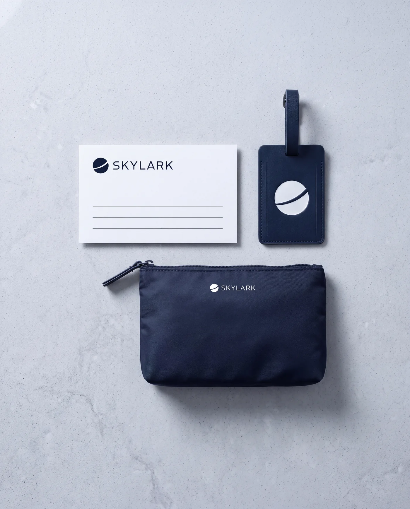
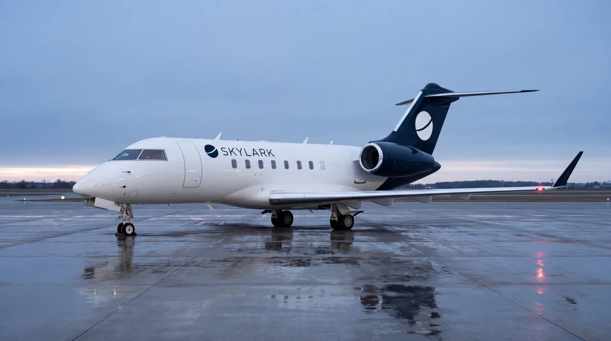
SKYLARK is a concept we built to show how to build a brand identity from the first step; the business is fictional. It is a private aviation company created from nothing: name, strategy, wordmark and monogram, palette, type pairing, imagery, and applications from the aircraft livery to the booking app. The same mark has to work on a tail fin seen from hundreds of metres and on an icon the size of a fingernail.
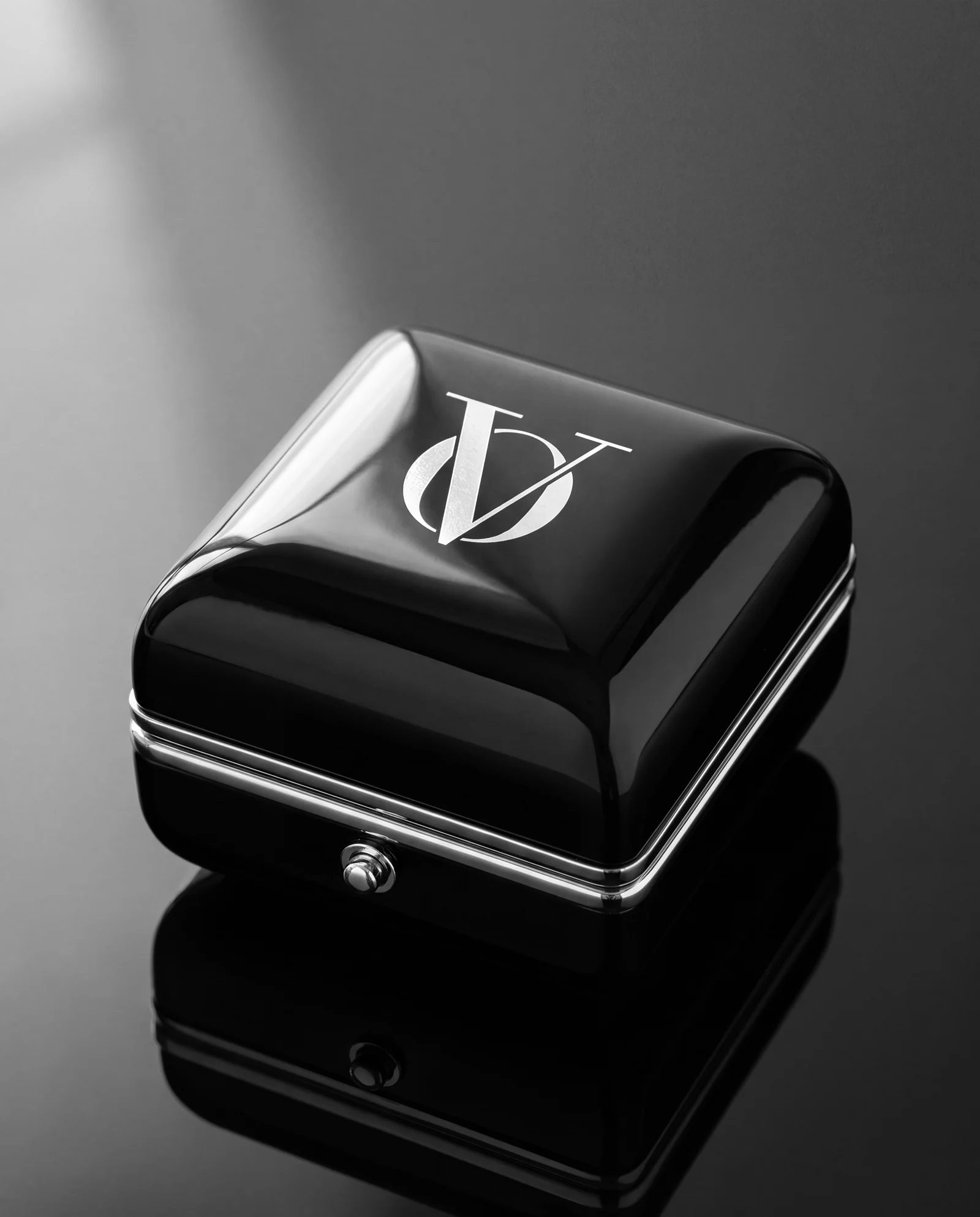
The OVELLE identity and packaging, for a fictional jewellery house, uses a wordmark, a monogram and platinum-foil boxes, and shows an identity moving from box to online store; building a luxury online store picks up from there. ALBA shows a real estate identity carried into site hoardings and sales material. All are on the examples page.
Identity sits within our websites and branding service, since identity and website are usually built together. To start, send a brief. The reply comes by email with a written direction, a price and a date.
No term matches.
Questions
How long does it take to brand a business from zero?
Without naming, usually 6 to 10 weeks; with naming, 9 to 14 weeks or more. The biggest variable is feedback speed and how many people sign off each stage.
What is the difference between a logo and a brand identity?
A logo is one mark. A brand identity is the full system: logo, colours, typefaces, photographic style, tone of voice and the rules that connect them, so every application looks like the same business.
How many design directions should a studio present?
Two or three developed directions, each with colour, type and sample applications. More than that usually slows the decision and reduces the depth of each option.
Which logo file formats should I receive?
SVG and vector PDF for web and print, transparent PNG for documents and social media, plus a favicon and app icon, in colour and black and white. Alongside them, a brand book with colour values and typefaces.
How do you pair typefaces for two scripts, such as Hebrew and Latin?
Choose both together and set them on the same line. Match size and weight by eye, not by point value, and confirm both have a web licence.
Getting started
Want this for your business?
Send a short brief: three required questions, the rest only if you like. We reply by email with a direction, a written price and a date.