What goes in a brand book, page by page
What a brand book is, how it differs from brand guidelines, what it must contain, and how to test that it works in the hands of people who did not design it.
Part of the guide: Business branding guide: what branding includes, from strategy to trademark

A brand book is the document that explains how to use a business’s identity without asking the designer. What is in a brand book, in practice: the story and values, the logo and how not to use it, colour values for print and screen, typefaces, grid, photography direction, iconography, tone of voice with examples, and applications such as signage, stationery, packaging, social media, website UI and motion. A good one is as short as it can be, full of examples, and written for the people who will actually use it: printers, developers, agencies and new staff.
Brand book, brand guidelines, style guide: what the terms mean
The terms overlap, and every studio uses them slightly differently. The common distinction is worth knowing, but the name matters less than the contents.
- Brand book: usually the broadest document. It opens with the story, values and positioning, and only then moves to the visual and verbal rules.
- Brand guidelines: the practical rules themselves, how to use the logo, colour, type and photography. In many businesses this is the same document as the brand book, minus the story chapter.
- Style guide: usually narrower. Sometimes it covers writing only (how to write numbers, dates, product names); sometimes it is a component library for a digital interface, written for developers.
For a small or mid-sized business, one document that combines all three is usually enough. Larger organisations with a product team and a content department often split it into three, each maintained by a different team.
Brand book contents, chapter by chapter
The table lists the common chapters, what each contains and who actually relies on it. Not every business needs all of them. A restaurant without retail packaging can drop the packaging chapter; an app with no physical premises can drop signage.
| Chapter | What goes in | Who uses it |
|---|---|---|
| Story and values | Positioning sentence, audience, three or four values with a short explanation each | New staff, agencies, copywriters |
| Logo | Every version, clear space, minimum size, permitted backgrounds, examples of misuse | Designers, printers, sign makers |
| Colour | Palette with CMYK, Pantone, RGB and HEX values, proportions of use, approved contrast pairs | Printers, developers, designers |
| Typography | Typefaces for every script used, heading hierarchy, sizes, spacing, fallbacks when the font is unavailable | Designers, developers, office staff |
| Grid and layout | Margins, columns, logo placement in common formats | Designers, agencies |
| Imagery and photography | Light, colour, distance, what is in frame and what never is, good and bad examples | Photographers, content creators, agencies |
| Iconography | Line style, weight, corners, icon grid, a ready library | Developers, UI designers |
| Voice and tone | How the business sounds, with do and don’t examples | Writers, customer service, social media |
| Applications | Signage, stationery, packaging, social media, website UI, motion | Every supplier |
| Files and contacts | Where the files live, who approves exceptions, version number | Everyone |
The chapters most brand books get wrong
Almost every brand book shows a handsome logo on a white background. The difference between a book that works and one that stays in a drawer lies in the following details.
Logo: clear space, minimum size and misuse
Clear space should be defined in a unit taken from the logo itself, such as the height of the first letter, so it stays correct at any size. Minimum size should appear twice: in pixels for screen and in millimetres for print. The misuse page is the most useful page in the whole book: a stretched logo, a logo on a busy photograph, a colour outside the palette, a drop shadow, a frame, a rotation. One visual example of each mistake is worth a paragraph of explanation.
Colour: separate values for print and screen
One colour needs four values. HEX and RGB for screens and code. CMYK for standard process printing. Pantone for spot-colour printing, where the shade has to be exact, on packaging for instance. The values do not convert into one another perfectly, so each is set separately and checked on a printed proof. A black-and-white identity still needs definitions: the black used for text is not the black used for a large solid area in print, and the exact values are best agreed with the printer. Finishes such as metallic foil are not colours at all; they are specified as a separate layer in the production file.
Typography across scripts
If the business writes in more than one script, the book should show the typefaces together, not on separate pages. Define equivalent sizes (a Hebrew face at 16 points does not look like a Latin face at 16 points), matching weights, and line spacing for each script. Include a mixed line, for instance an English product name and a price inside a Hebrew sentence. Name a fallback font for office documents and email, because the original typeface is rarely installed on the recipient’s computer.
Voice and tone with real examples
Three adjectives such as warm, professional and trustworthy help no writer. What helps is do and don’t examples, using the business’s own real messages:
| Situation | Do | Don’t |
|---|---|---|
| Shipping update | Your order left today and arrives within two days. | Yay! Your amazing order is on its way to you! |
| Product description | 18-carat gold, 42 cm chain, spring clasp. | A mesmerising piece that will turn every head. |
| Declining a request | That slot is taken. Tuesday at 11:00 or 14:00 is open. | We regret that we are unable to accommodate your request at this time. |
PDF or a living web page
A PDF brand book is easy to send to a printer or an agency, easy to approve and easy to archive as a closed version. Its weakness is that it ages: linked files change, someone forwards an old copy, and there is no way to know who is working from what. A living web page updates in one place, lets people download files straight from each chapter, and suits developers who need to copy colour values and code snippets. Its weakness is that someone has to maintain it.
For most businesses we recommend both: a web page as the single source of truth, and a PDF exported from it, stamped with a version number and a date, for suppliers. That way every supplier knows exactly which version they worked from.
Who uses a brand book, and what each person looks for
- Printers look for CMYK and Pantone values, vector files, specifications for special finishes and minimum size in millimetres.
- Developers look for HEX values, font names with web licences, spacing, button states and an SVG icon library.
- Agencies and content creators look for photography direction, tone of voice, social templates and rules for placing the logo on video.
- New staff look for the story, the values, and how to write an email or a presentation without breaking anything.
- Sign and uniform suppliers look for single-colour logo versions, size ratios and examples on real materials.
When writing the book, picture each of them opening it with one question, and check the answer can be found within a minute.
How to test a brand book
The simplest reliable test: hand the book to someone who did not design it and ask them to produce something. An outside designer, a developer or a member of staff receives the book and the files, with no further explanation, and is asked to create a social post, a small ad and a presentation slide.
- If they ask a question, the answer is missing from the book or hard to find.
- If the result looks like the business, the book works.
- If the result is technically correct but does not feel like the business, the photography and voice chapters are too thin.
- If they used the wrong file, the folder structure and file names need work.
A second test is a print proof: a business card and a packaging sample produced from the values in the book. It shows before production whether the print colour values are right.

Maintenance and versioning
A brand book is a living document. The business opens a second location, launches a product, joins a new social platform, and finds there is no rule that covers it. Without maintenance, each of those moments produces a local workaround, and a year later there are five versions of the same logo.
- Every version carries a number and a date on the cover, and a short change log at the end.
- One person owns the book and approves exceptions. Not a committee.
- Review it once a year, or before any major launch.
- Old versions are archived, but the main link always points to the current one.
Brand guidelines examples: ALBA, OVELLE and SKYLARK
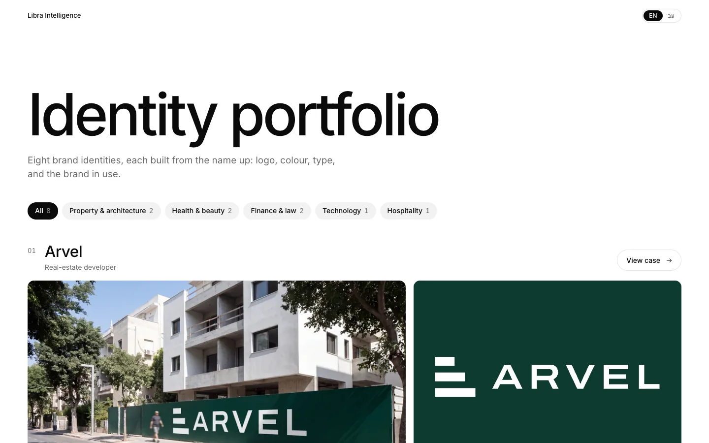
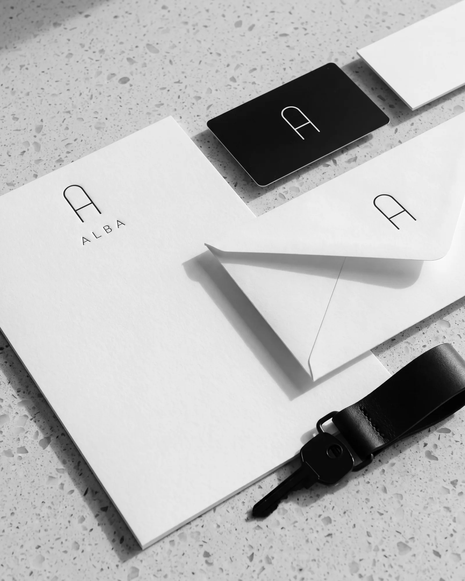
All three are concepts we built; the businesses are fictional. The ALBA brand guidelines, for a residential tower, cover logo, colour, type, site signage and sales material. They are a good example of a book that mainly serves suppliers: sign makers, printers and the investor deck. How the same identity carries into a deck is covered in the real estate investor deck guide.
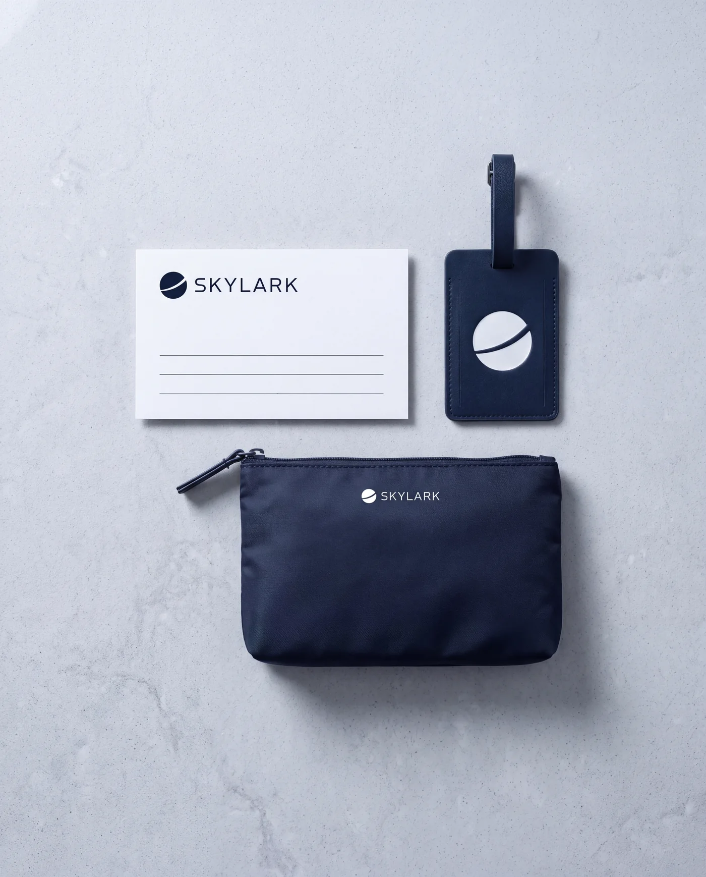
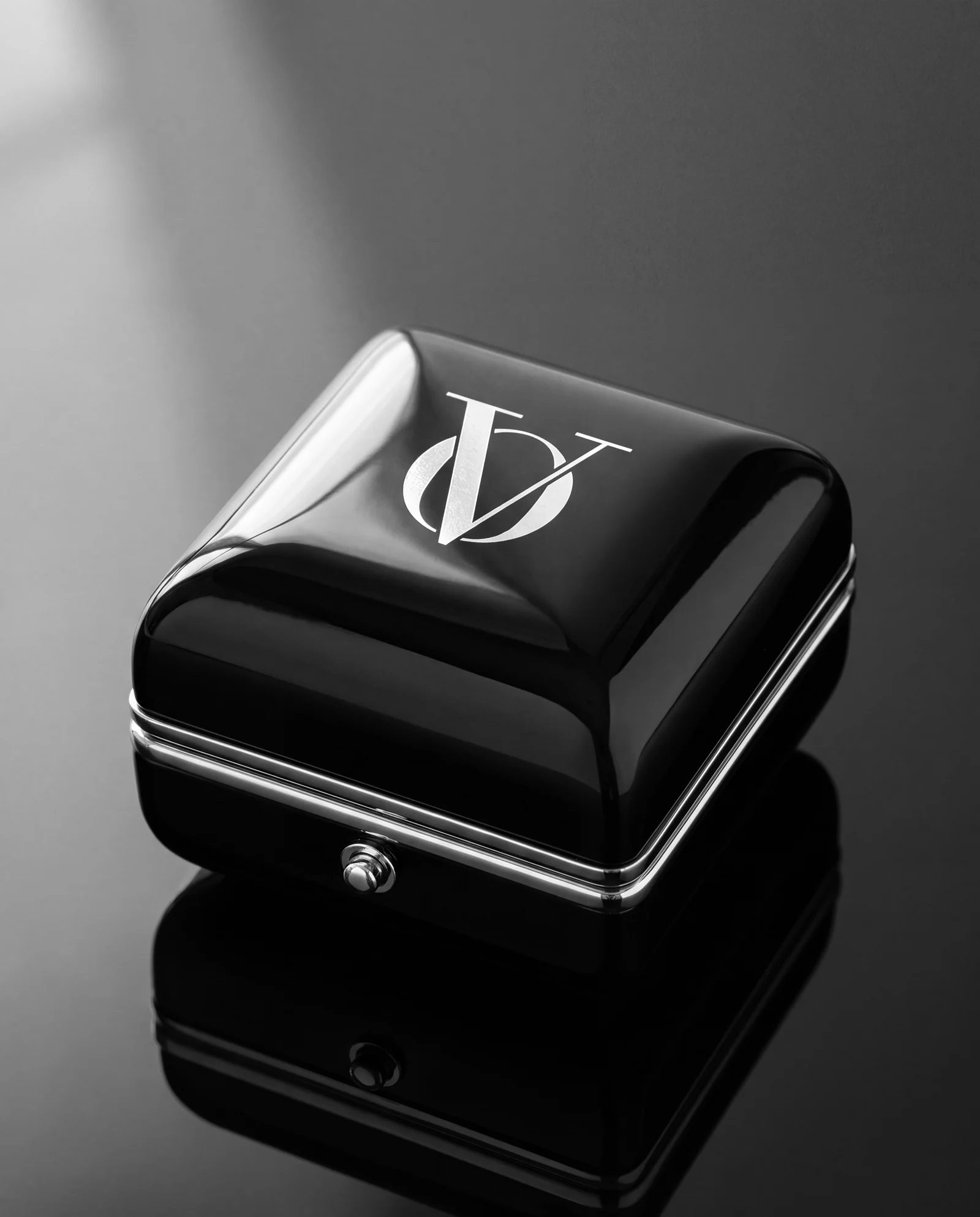
The OVELLE identity, for a jewellery house, is built on a wordmark, a monogram and packaging finished in platinum foil. It shows how to specify a finish that is not a colour, and how the same language moves from the box to the online store. SKYLARK, a private aviation company, shows a book built alongside a brand created from zero, from the aircraft livery to the app. The stages that come before the book are covered in branding a business from zero.
Brand books are part of our websites and branding service. If you have an identity with no book, or a book nobody uses, send a brief; how to brief a studio will help you write it. The reply comes by email, with a written direction, a price and a date.
No term matches.
Questions
What is in a brand book?
Story and values, logo rules including clear space, minimum size and misuse, colour values for print and screen, typography, grid, photography direction, iconography, tone of voice with examples, and applications such as signage, packaging, social media and website UI.
What is the difference between a brand book and brand guidelines?
The terms overlap. A brand book usually includes the story and values as well, while brand guidelines focus on the practical rules. For a small or mid-sized business, one document that combines both is enough.
Which colour values should brand guidelines include?
HEX and RGB for screens, CMYK for standard print and Pantone for spot colours. Each is set separately and checked on a printed proof, because they do not convert into one another exactly.
Should a brand book be a PDF or a website?
For most businesses both work best together: a web page as the single source of truth, and a versioned, dated PDF exported from it for suppliers.
How do you know a brand book works?
Give it to someone who did not design it and ask them to produce a post, an ad and a slide. If they have no questions and the result looks like the business, the book works.
Getting started
Want this for your business?
Send a short brief: three required questions, the rest only if you like. We reply by email with a direction, a written price and a date.