How to build a landing page that converts
The anatomy of a landing page that brings enquiries: one message, one action, a short form and every lead measured. With a working launch page for a residential project.
Part of the guide: How to build a business website, step by step
A landing page that converts is a single page with one message and one action, built for visitors arriving from one source, usually an ad. Within a few seconds a visitor should know what is on offer, why it matters to them and what to do next. Everything else on the page exists to remove doubt before that action: facts, images of the real product, answers to likely questions and a short form. And it is built so that every lead can be traced back to where it came from.
Landing page versus website
A website serves many audiences and many goals: people researching, people looking for a job, existing customers. It has navigation, links to other pages and plenty of ways out. A landing page does the opposite. It is made for one campaign or one offer and strips out anything that does not lead to the action. There is usually no main menu, and if there is one, it jumps to sections of the same page.
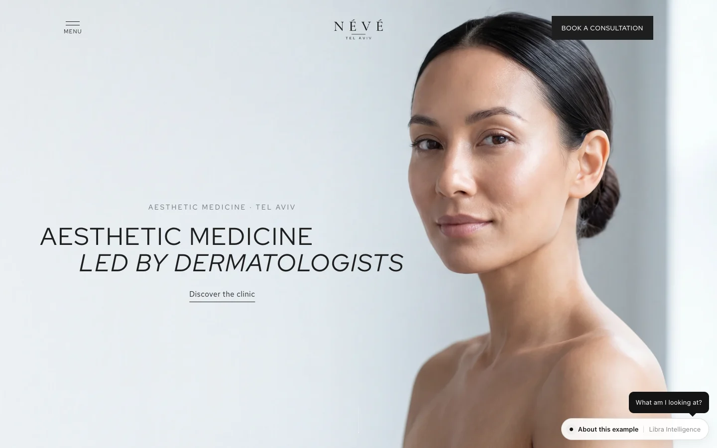
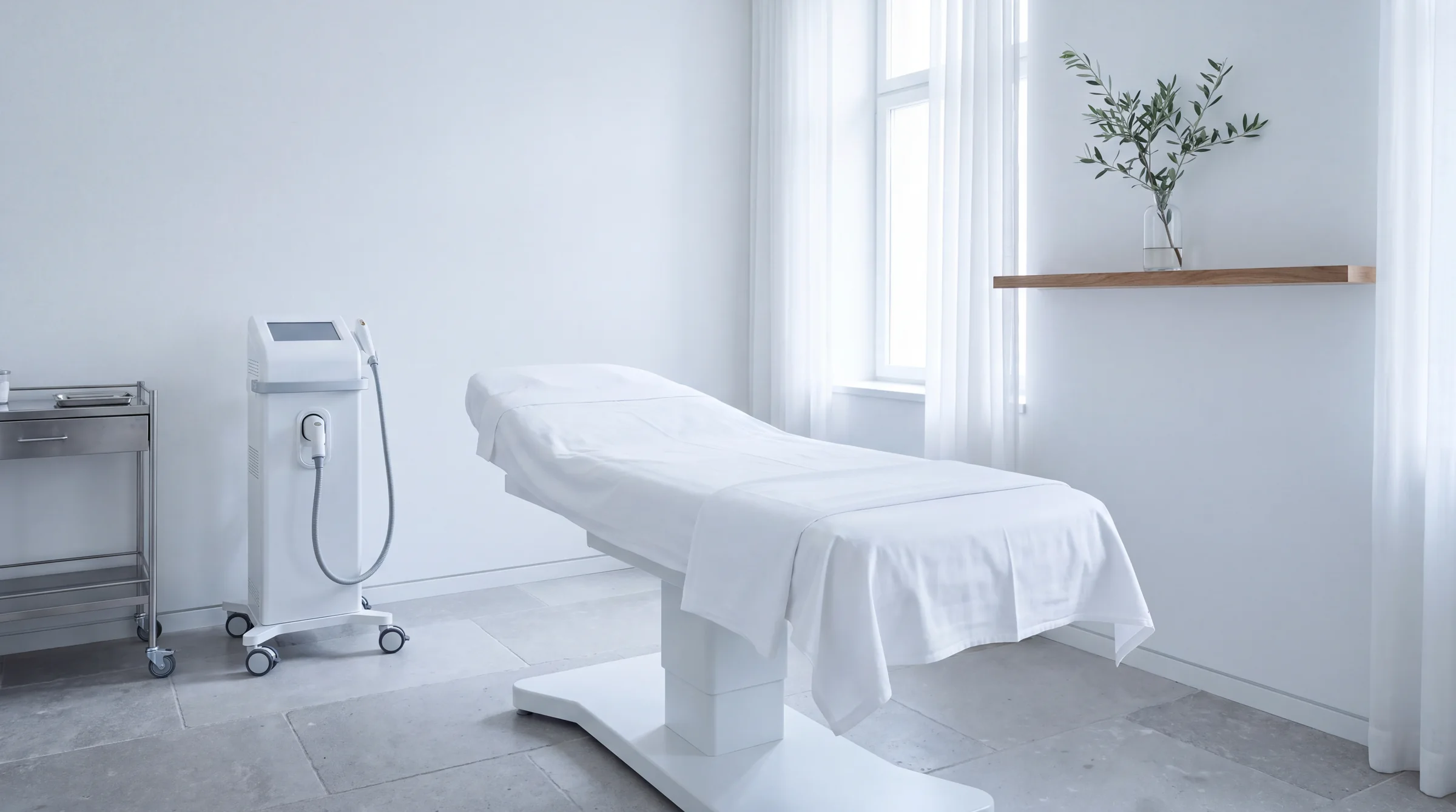
An aesthetic clinic, for example, needs a website with every treatment, the team and the practical information, like the Névé clinic website. But when it runs a campaign for one treatment, the ad should lead to a page about that treatment only, with a form to book. Send the ad to the home page and the visitor has to search for what they were promised; most will not bother. A dedicated page also makes it clear what produced the enquiry.
One message, one action
Before designing anything, write two lines: what we are offering, and what we want the visitor to do. If those two lines are unclear, the page will be too. One action means one button that repeats down the page with the same wording, such as “Get the price list”, “Book an appointment” or “Download the brochure”. Not three buttons competing with each other, and not social links at the top.
The headline should state a fact rather than a slogan. “Three- and four-bedroom apartments in a new tower in Tel Aviv, estimated handover 2028” works better than “Live on a higher level”, because the reader knows at once whether it is for them. If there is a time-limited offer, it has to be real and precise.
Above the fold: the anatomy of the first screen
The first screen, everything visible before scrolling, is where most visitors decide whether to stay. On a phone it is small, so you have to choose:
- A headline that says what is offered, in the words your audience uses.
- One supporting line that answers “why this is relevant to me”: location, starting price, date, outcome.
- An image or video of the thing itself: the product, the place, the treatment. Not stock photography.
- The call-to-action button, clear and prominent, leading to the form or opening it.
- At most one trust signal: the developer’s name, a licence number, years in business. A fact, not an adjective.
What does not belong there: a rotating slider, a full menu, an instant pop-up, three offers side by side.
Proof without fake testimonials
People leave their details when they believe the offer is real. The strongest proof is facts someone could check: names, numbers, places, dates, certifications. For a property launch that means the developer and architect, the number of units, the address and the handover date. For a clinic, the doctor’s name, their training and the device used. For a store, a clear returns policy and a stated delivery time.
Images of the actual product matter more than beautiful images. 3D renders of a building not yet built, product shots from several angles, photos of the real clinic. If you use AI to produce imagery, the product itself has to stay faithful to the original, or the customer will notice the gap the moment they see it in person.
Customer testimonials are good proof only when they are real, named and used with permission. Invented reviews or anonymous quotes damage trust as soon as someone spots them, and in some sectors they raise legal problems too. If you have no testimonials yet, leave them out and let the facts do the work.
Form length and fields
Every field is one more reason not to submit. Ask only what you need to follow up well. On most landing pages that is name, phone and email, sometimes plus one qualifying question: which apartment type, which treatment, when. Everything else can wait for the next conversation.
- Visible labels above the fields, not only placeholder text that disappears as you type.
- The right keyboard on mobile: numeric for phone, email keyboard for email.
- Error messages that say what to fix, next to the field itself.
- A separate, unticked consent box for marketing email. Many countries require explicit prior consent for email or SMS marketing.
- A thank-you page that says what happens now: when you will hear back, through which channel, and what to do meanwhile.
Test the form end to end before every campaign: send a test lead, confirm it reached the CRM with all its details, and check that the visitor received a confirmation.
Mobile first, speed and message match
Most traffic from social ads arrives on a phone, so design the page for the phone first and the wide screen second. That means a button easy to hit with a thumb, text readable without zooming, a form that never scrolls sideways, and a call to action that stays within reach as the visitor scrolls.
Speed is part of conversion. Google’s Core Web Vitals define “good” as LCP within 2.5 seconds, INP within 200 milliseconds and CLS of 0.1 or less (web.dev). On a landing page the usual culprits are heavy images and video, stacked tracking scripts and pixels, and fonts. A 3D model or background video is possible, but load it after the headline and button are already on screen.
Message match means that what the ad promised appears on the page immediately, in the same words and with the same image. If the ad talks about “early pricing for three-bedroom apartments”, the page headline cannot talk about “a new life in the city”. When you run several ads with different angles, it is often worth having several headline versions, one per message.
Landing page structure, section by section: the ALBA example
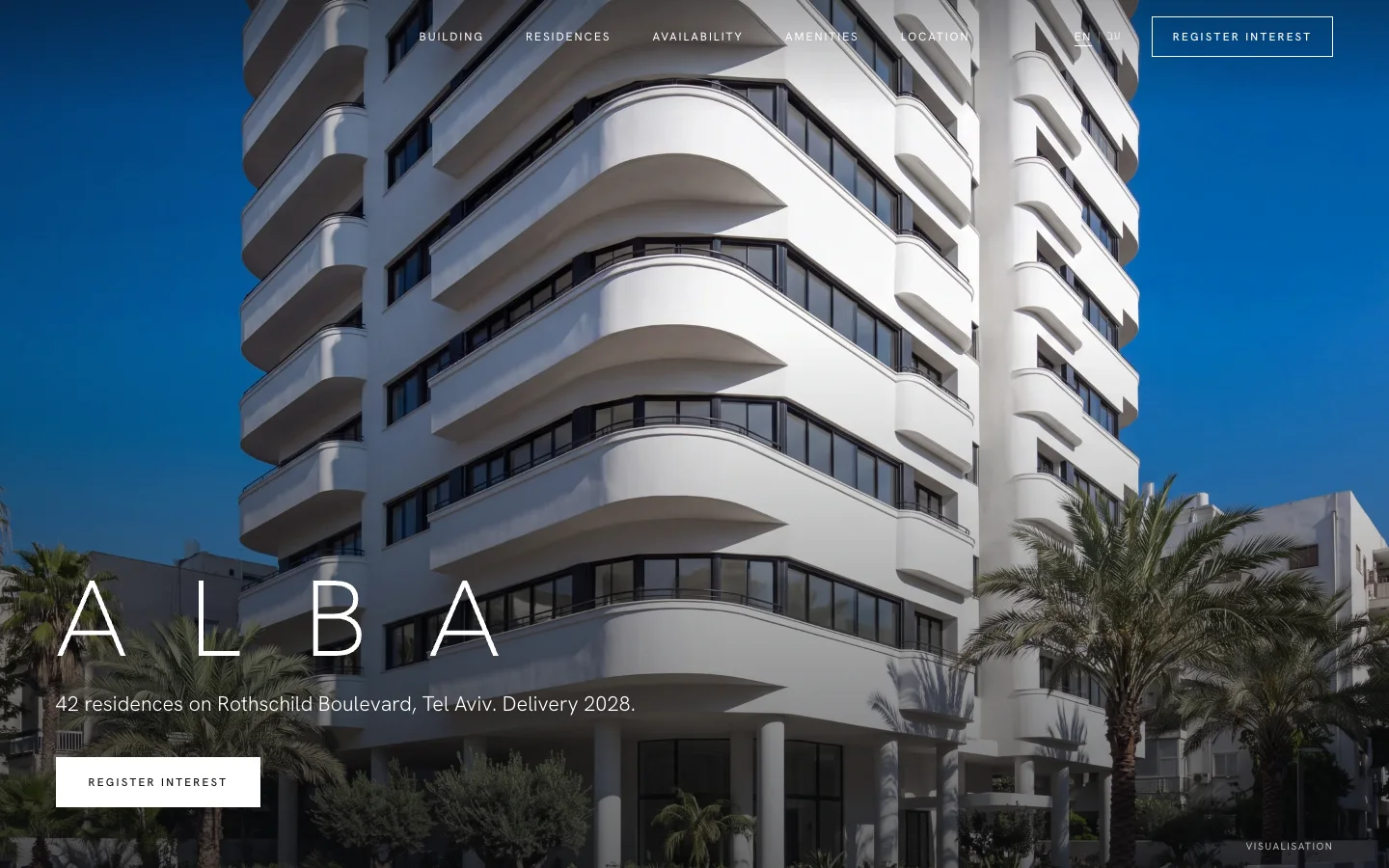
The ALBA launch page is a concept we built for a residential tower; the business is fictional. At its centre is a 3D model of the tower that visitors can rotate, and every section on the page leads to the same registration form. This is the structure:
| Section | What it does | What it contains |
|---|---|---|
| First screen | Says what is offered and to whom | Project name, a factual headline, the 3D model, a registration button. |
| Key facts | Answers the first questions | Location, apartment types, estimated handover, developer and architect. |
| The residences | Shows exactly what is being bought | Floor plans, interior renders, size ranges. A “Get the floor plans” button. |
| Location | Explains the surroundings | Map, travel times, what the neighbourhood offers. Registration button. |
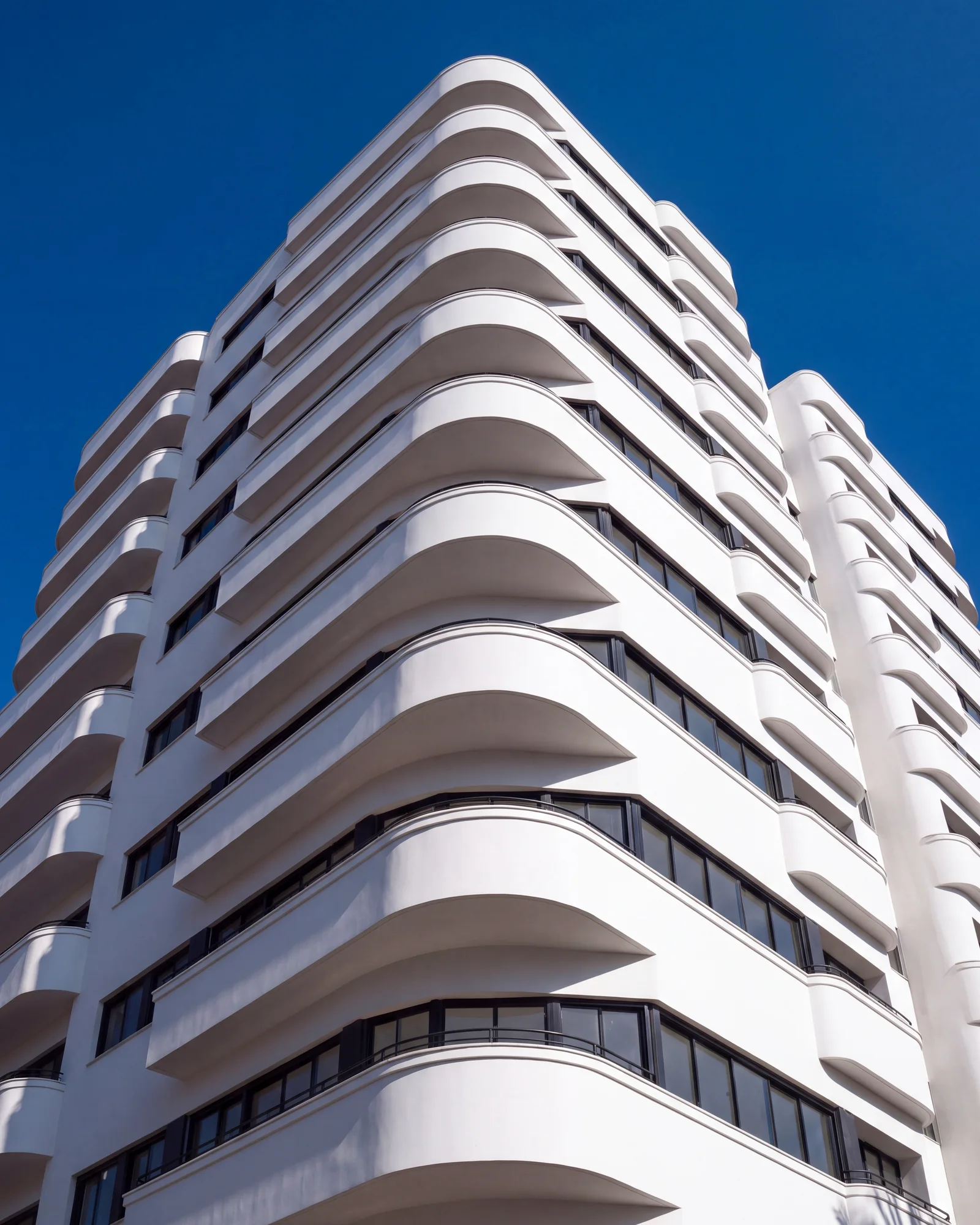
| Architecture and materials | Builds confidence in quality | Exterior renders, materials, key specification. |
| FAQ | Removes the last doubts | Buying process, financing, timeline. |
| Registration form | The only action | Name, phone, email, preferred apartment type, separate marketing consent. |
| Footer | Legal information | Developer details, accessibility statement, a note that renders are illustrative. |
The same structure carries over to other sectors. A clinic swaps the residences for the treatment, the location for the doctor and the clinic, and the registration form for booking.
Tracking every lead
A landing page without measurement is a guess. To know what works you need to know where each lead came from and what happened to it afterwards:
- UTM parameters on every ad link: source, medium, campaign and ad. That shows which ad produced the enquiry.
- One clear conversion event, fired when the form is submitted successfully, not when the button is clicked. The same event goes to Google, Meta and any other platform you advertise on.
- UTMs captured in the form as hidden fields, so the source enters the CRM together with the lead.
- A CRM that receives the lead instantly, assigns it to someone and tracks its status. The ALBA CRM and sales dashboard shows how that looks.
- Closing the loop: check not only how many leads each ad produced, but how many became a meeting or a sale.
Without that last step it is easy to keep funding an ad that brings many cheap leads, none of whom buy.

Testing and improving after launch
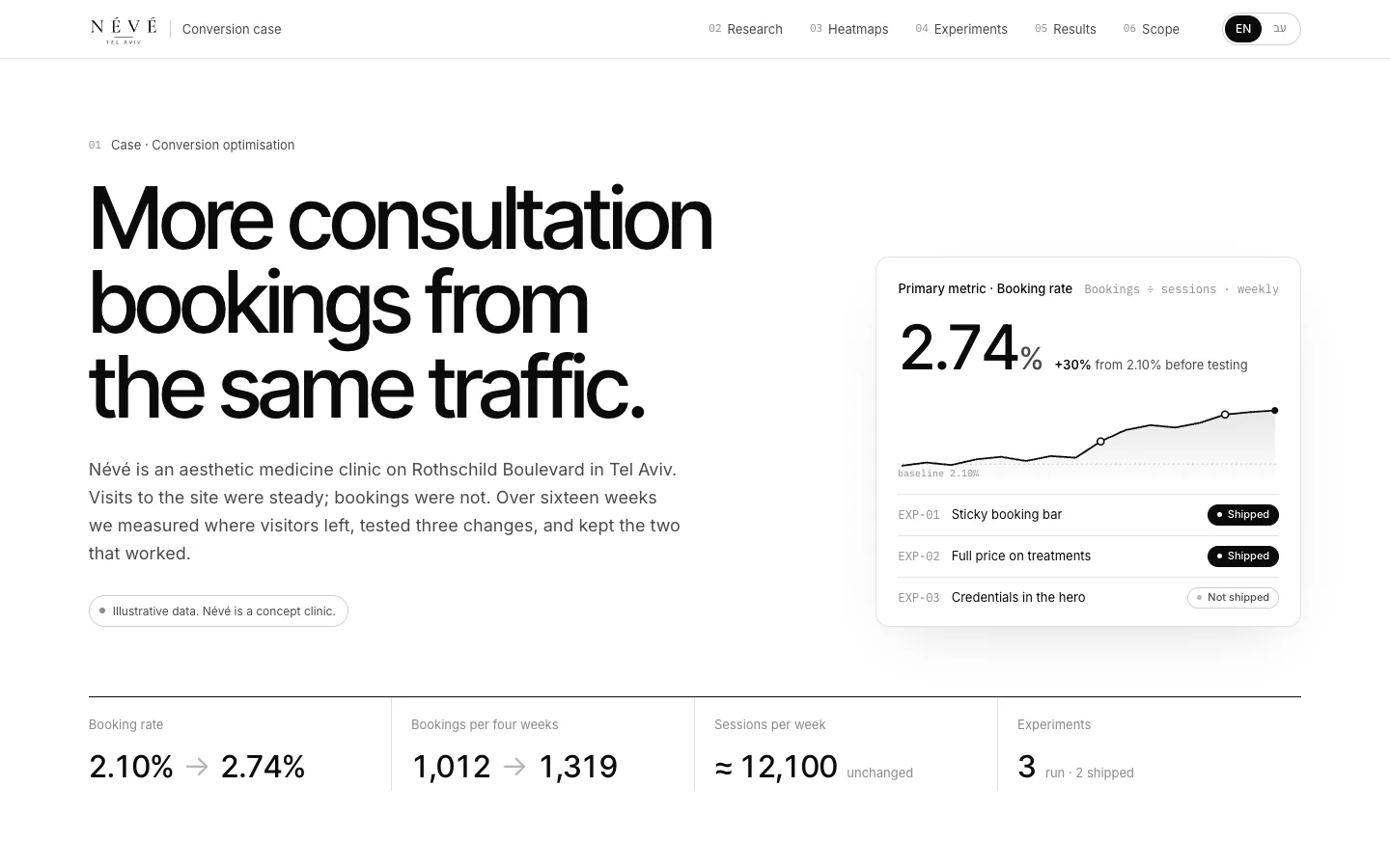
A landing page is not finished on launch day. Once traffic arrives you can see where people stop, what they read and where they abandon the form. Heatmaps, session recordings and form-field analysis produce hypotheses; an A/B test confirms or rejects them. A test needs enough traffic to reach a reliable result, and on low-traffic pages it is better to improve from research than to run tests that never conclude. We cover the process and the arithmetic in our guide to A/B testing and CRO, and you can see it applied in the Névé conversion optimisation work, another concept we built.
A landing page is one of the smaller and faster website projects. What it costs and what moves the price is covered in how much a business website costs, and the service itself is described on our websites and landing pages page. If the page also needs to rank in organic search, our SEO and GEO guide explains what else is required.
If you have a campaign coming up, send a brief with the offer, the audience and where the traffic will come from. We reply by email with a proposed page structure, a price and a date.
No term matches.
Questions
What is a landing page?
A landing page is a single page built for one campaign or offer, with one message and one action such as registering or booking. Unlike a website, it has no full menu and few ways out.
How many fields should a landing page form have?
Only what you need to follow up, usually name, phone and email, sometimes plus one qualifying question. Every extra field lowers the chance the form is submitted.
Can I send ad traffic to my home page instead?
You can, but visitors then have to find what the ad promised on their own, and measurement is less precise. A dedicated page that matches the ad usually converts and measures better.
How do I know which ad a lead came from?
Add UTM parameters to every ad link, capture them in hidden form fields, and pass them to your CRM with the lead. That also lets you see which ads produced sales, not just enquiries.
Should a landing page use customer testimonials?
Only real ones, named and used with permission. Without them, checkable facts and images of the real product work better than generic praise.
How fast should a landing page load?
Google treats an LCP within 2.5 seconds as good, alongside INP within 200 milliseconds and CLS of 0.1 or less. Show the headline and button first and load heavy video or 3D models afterwards.
Getting started
Want this for your business?
Send a short brief: three required questions, the rest only if you like. We reply by email with a direction, a written price and a date.